
NEW MOM
ON THE BLOCK
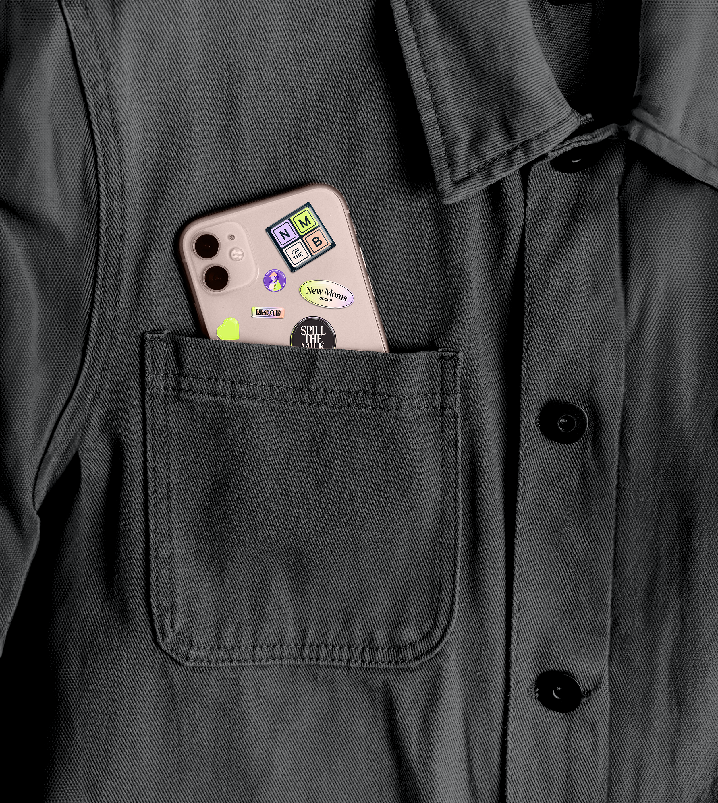
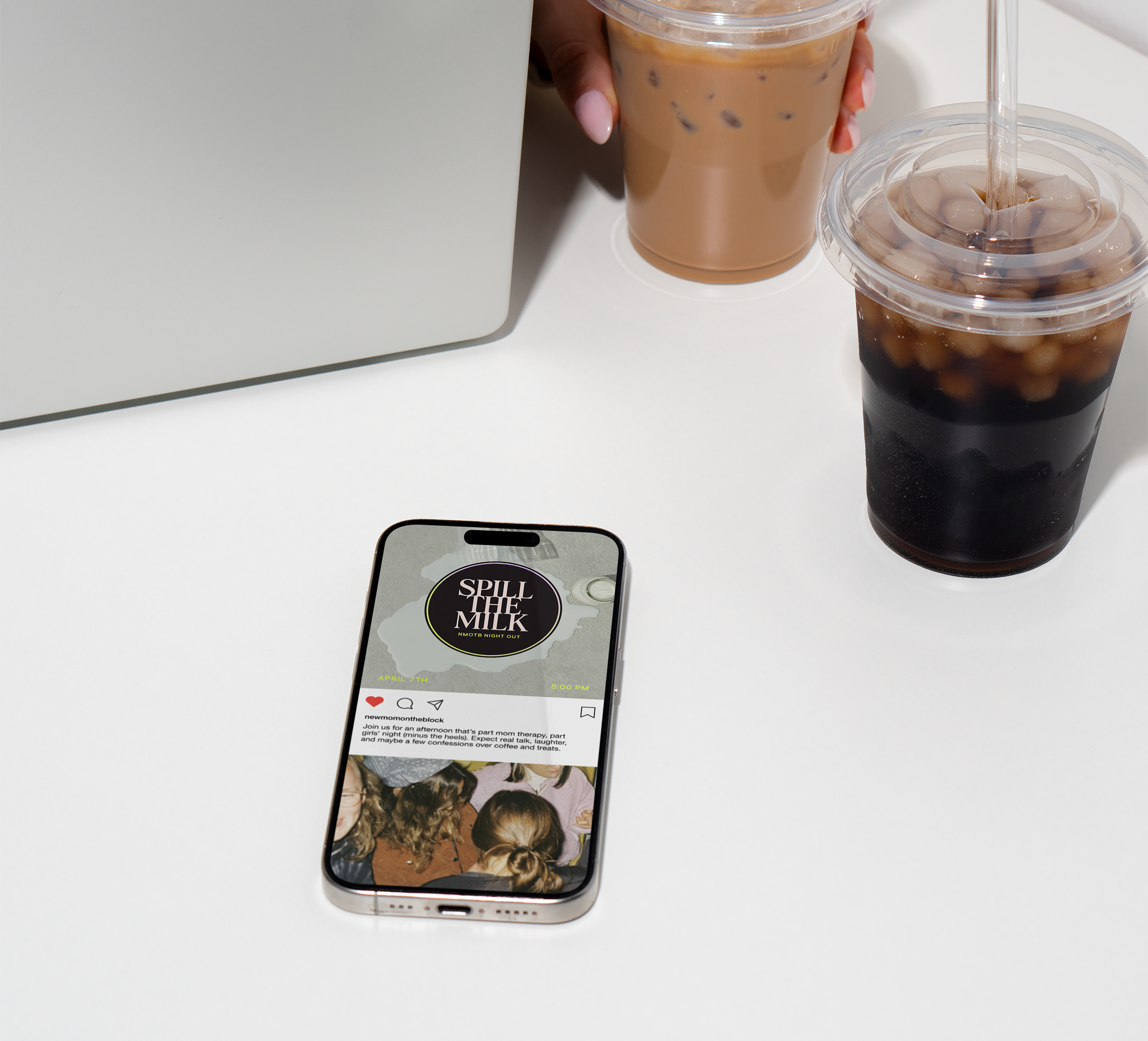
New Mom on the Block, created by Lindsey Legister, is more than a YouTube channel — it’s a vibrant, inclusive community built to support and connect moms from all backgrounds and walks of life.
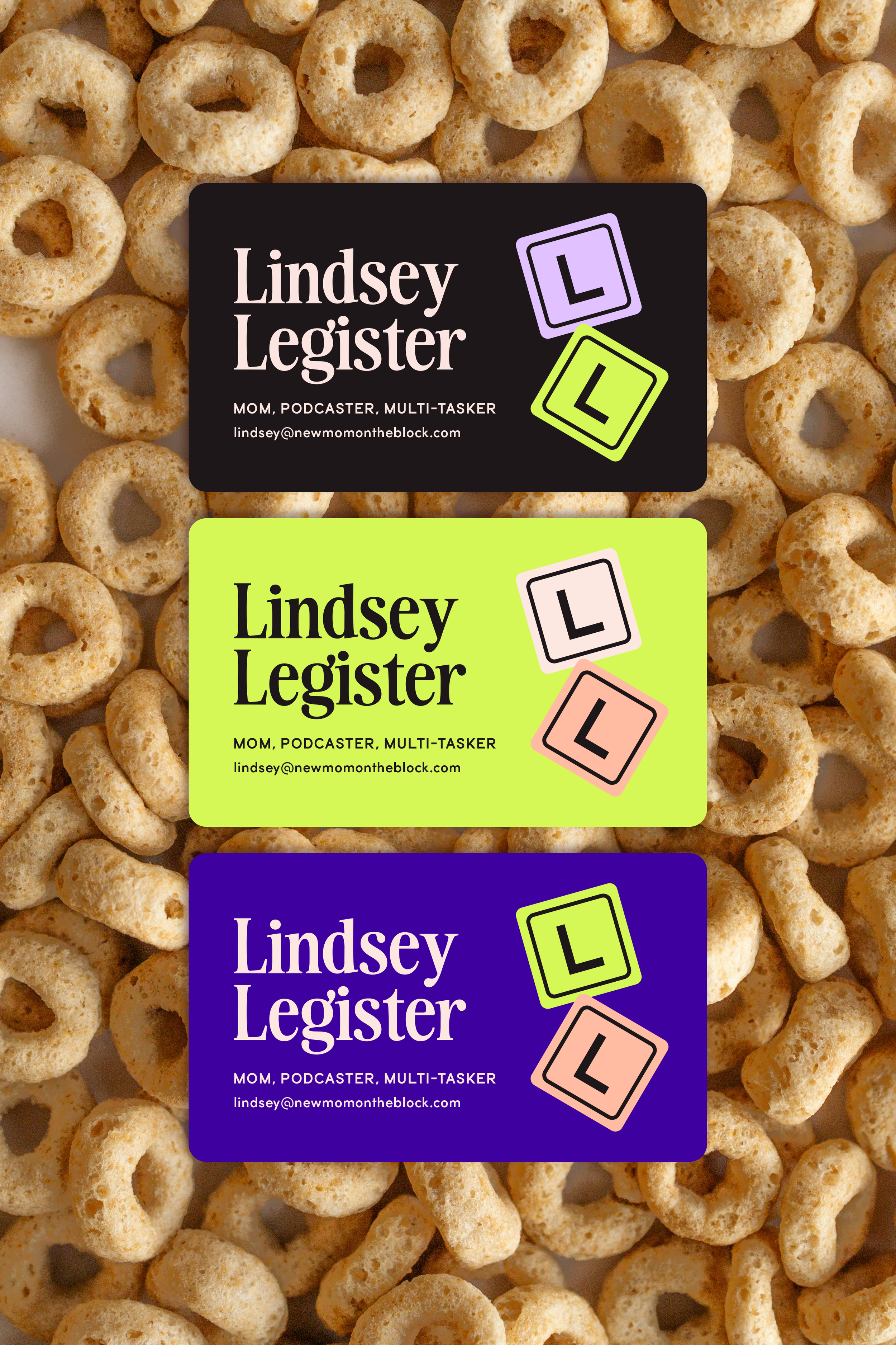
To reflect this mission, we crafted a bold brand identity featuring bright, welcoming colors that celebrate diversity and a flexible, scalable logo suite designed to shine across everything from hats and sweatshirts to YouTube title cards and beyond. With playful graphics and adaptable design elements, the brand fosters a sense of joy and belonging, ensuring that the modern mom feels seen, supported, and empowered.
SCOPE → BRANDING & MERCH
TL;DR → A 360 SUPPORT SYSTEM FOR NEW MOMS


SUPPORT WHEN YOU NEED IT
New Mom on the Block, created by Lindsey Legister, is more than a YouTube channel — it’s a vibrant, inclusive community built to support and connect moms from all backgrounds and walks of life.
To reflect this mission, we crafted a bold brand identity featuring bright, welcoming colors that celebrate diversity and a flexible, scalable logo suite designed to shine across everything from hats and sweatshirts to YouTube title cards and beyond. With playful graphics and adaptable design elements, the brand fosters a sense of joy and belonging, ensuring that the modern mom feels seen, supported, and empowered.


WHITE RIVER TROUT CLUB BRANDING
SCOPE ʘ BRANDING, PRINT AND PROMOTIONAL GRAPHICS
White River Trout Club is a premier fishing lodge nestled along the scenic White River in Flippin, Arkansas. Designed for those seeking both adventure and relaxation, it offers a place to gather, unplug, and reconnect with nature.
Our branding approach reflects a modern and inviting fishing experience, appealing to anglers of all skill levels. From digital platforms to print and promotional materials, we crafted a responsive design system that ensures seamless brand consistency across all touchpoints.
THE WORK


the brand kit
The logo system was designed with versatility in mind, incorporating a range of lockups vthat bring variety and visual interest—especially for apparel. Each element was carefully crafted to scale seamlessly, whether displayed as a bold mural on the lodge’s exterior or as a subtle embroidered badge. Thoughtful details, like the distinctive “W” formed from fly illustrations, add a unique touch that resonates with the brand’s identity while maintaining functionality across different applications.
RESPONSIVE LOGO SYSTEM

COLOR PALETTE

VARIATIONS & ILLUSTRATIONS
