
POPULUS REBRAND
SCOPE ʘ BRANDING AND ENVIRONMENTAL GRAPHICS
Connection to community and immersion in nature are the tenants of urban community garden, Populus. They requested a quirky brand identity that reflected just that.
Populus is inspired by the root systems of many plants that may appear as individuals, but under the ground, are connected to a whole network of others.
THE WORK


the brand kit
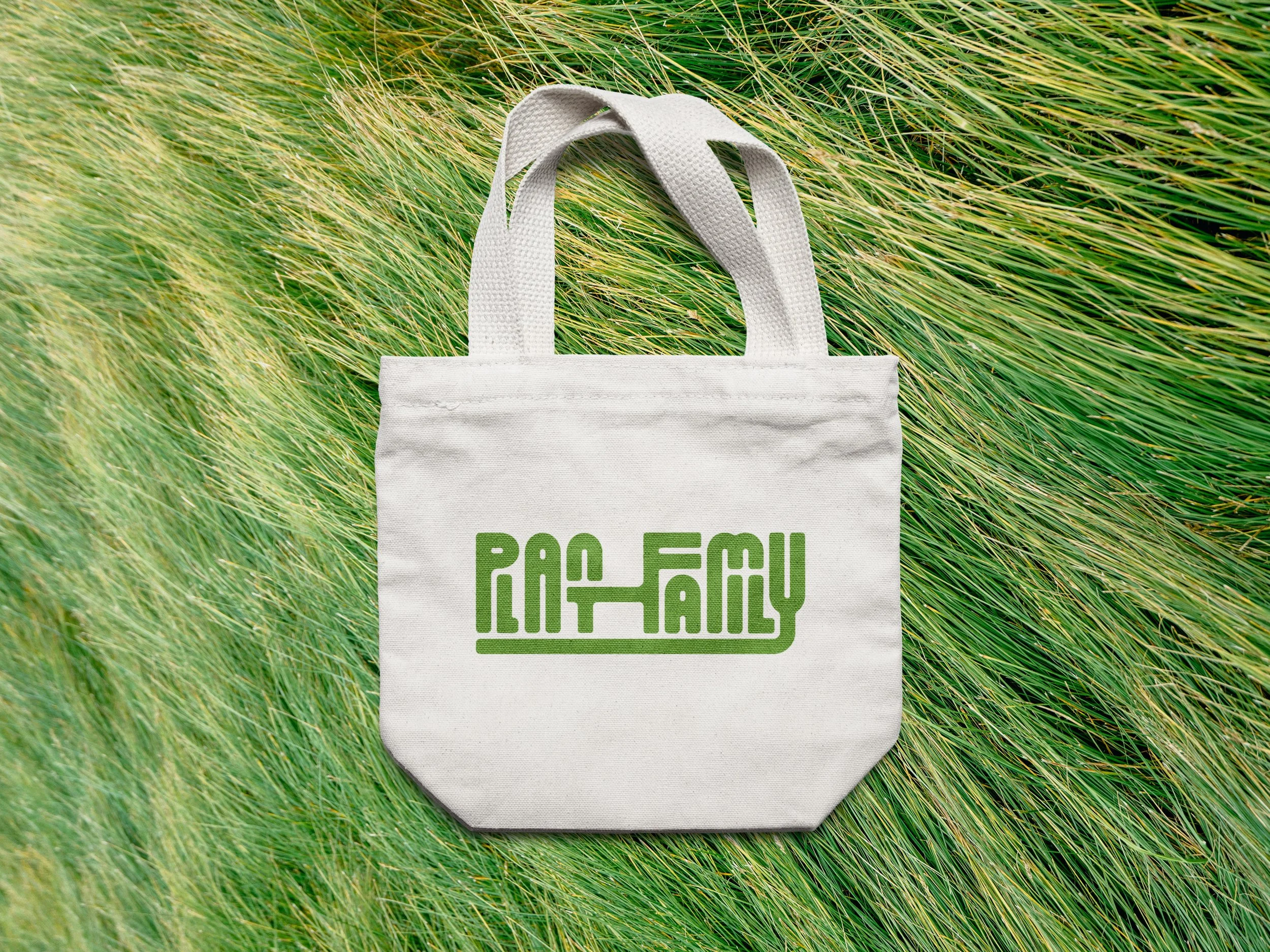
The wordmark leans heavily into its concept – the connection between letters emphasizes the connection in the community, and the connection of the root system in its namesake.
The textures and color palette are organic and friendly.
PRIMARY WORDMARK

STACKED WORDMARK

SUBMARK

COLOR PALETTE
