BEAR & SARGE BRANDING
SCOPE ʘ BRANDING
Bear & Sarge is a pickleball and tennis apparel brand inspired by the ease and charm of vintage racket clubs, long afternoons courtside, and the timeless appeal of leisure done well. The brand balances sporty nostalgia with playful modernity to appeal to the sports’ growing target audiences that span multiple generations.
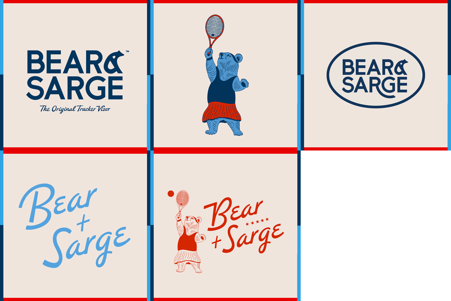
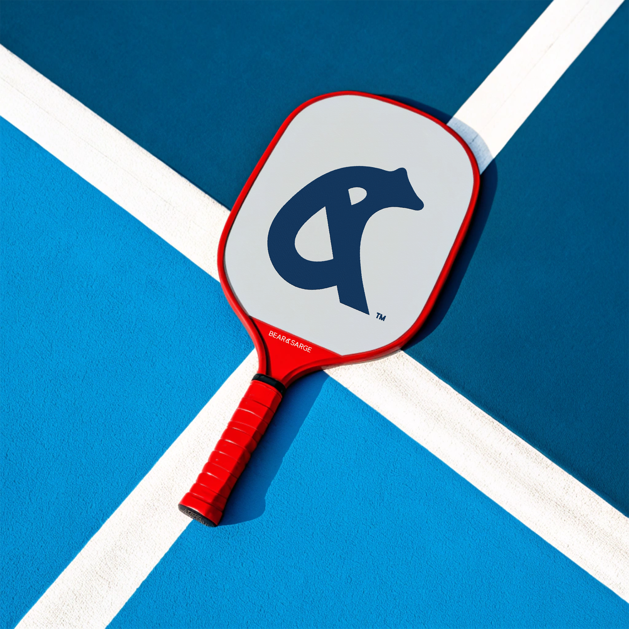
The founders needed branding that could be instantly recognizable on the smallest of tags – think a tiny red tag on a hat – as well as visual elements and illustrations that could be splashed across merch.
At the heart of the identity is the bear logomark, replacing the word “and” between Bear and Sarge. This icon is both a connective symbol and strong enough to stand alone.

THE WORK


the brand kit
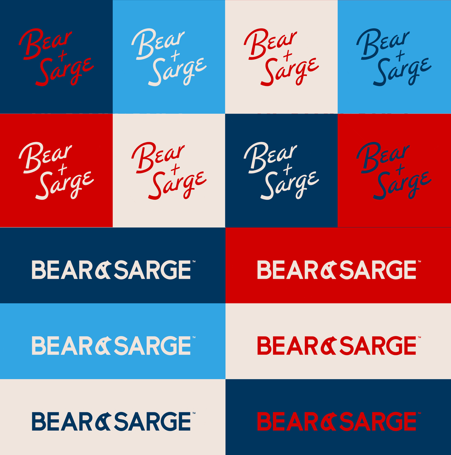
It was important in the logo system to create a variety of lockups and tags that can be used on apparel to create variety and visual interest. Especially important was the creation of an instantly recognizable, yet integrated logomark that could be used at small sizes on clothing tags.
The logotype features a rounded, retro-inspired sans serif, evoking casual athletic brands from the ’70s and ’80s. A friendly, unfussy palette of classic hues is paired with a soft pop of yellow to bring in a feminine touch and warmth.
Photography is carefree and sun-soaked—capturing moments that feel both nostalgic and effortlessly current.

RESPONSIVE LOGO SYSTEM
TYPE HIERARCHY


