ASCEND WHOLE HEALTH BRANDING
SCOPE ʘ BRANDING AND WEBSITE
The branding for Ascend Whole Health was developed for a healing practice rooted in Neurolinguistic Programming (NLP)—a transformative set of techniques designed to help clients release negative emotions and limiting beliefs.
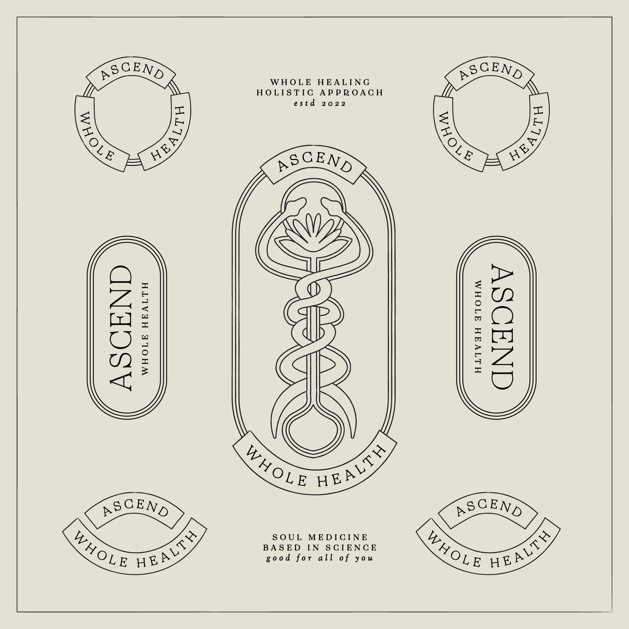
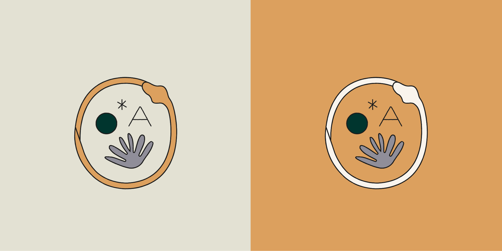
Ascend Whole Health’s visual identity invites clients into a space where healing feels both grounded and mystical. Rooted in the belief that magic is possible in the process of transformation, the branding weaves together symbolic elements to evoke deep personal change, integration, and wholeness. Ascend Whole Health’s founder is a medical doctor, so we included a hint of the caduceus (the serpent around the staff – but make it magical!).
THE WORK
the brand kit
Typography choices draw from academic associations of serif fonts, while the subtle ink-bleed quality evokes the timelessness of ancient philosophical or spiritual texts—further grounding the brand in thoughtful, transformative work. The serpent calls to mind the caduceus, while also functioning as a symbol of change, death and rebirth, and ascension. All logos within the system feel natural, have a human-touch, and belong in the world of the esoteric.

RESPONSIVE LOGO SYSTEM
COLOR PALETTE

